How to Make Your Own Digital Scrapbook Papers
"In a world of digital scrapbooking, here are some tips on customizing images and creating your own scrapbook papers and accessories for all occasions."
I think I want to write a post too about the process of making some of these pages from a random photograph I took. Coming soon. :)
Custom Search
Monday, 7 September 2009
Scrapbook Page Progression
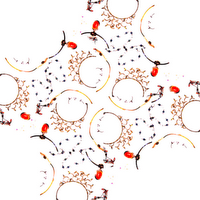
So some day last week (I think, who can keep track of time, he he) I was doing a photo shoot but didn't have anyone over so I just started taking pictures of random objects in my room. I wanted to really lay out props and do this whole elaborate setup, but you know me, I get really lazy. :) I ended up at one point just throwing some necklaces on a table. With only a little effort, the original picture edited and duplicated in Microsoft PowerPoint turned into the latter.
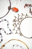
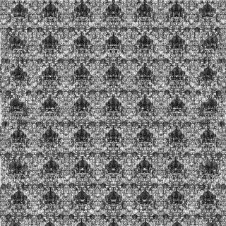
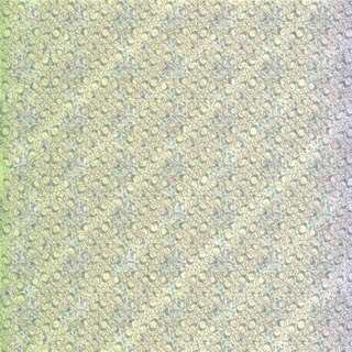
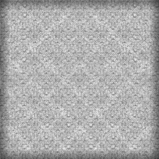
Which, when duplicated and resized and further edited in GIMP, turned into these. Nothing special, it's just the whole I-made-it factor. :)
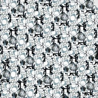
Details: Edited in Microsoft PowerPoint and GIMP.
Which, when duplicated and resized and further edited in GIMP, turned into these. Nothing special, it's just the whole I-made-it factor. :)
Details: Edited in Microsoft PowerPoint and GIMP.
Labels:
Editing,
Links,
scrapbooking
Monday, 31 August 2009
Opacity
In building on the last post, which talks about the wonders of having separate layers in a photo workbook, I thought I'd also mention the fact that GIMP lets you change the opacity of each layer. This makes for some fun effects if you want a slight overlay of the same image or even an entirely different image.
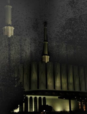
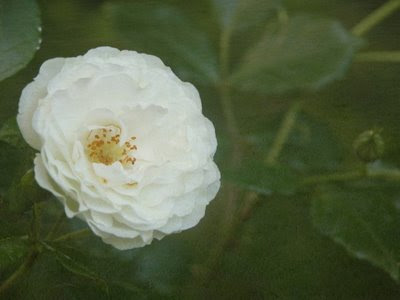
Details: For the first picture, I added an overlay of an enlarged version of the same picture (of the Provo, Utah, LDS Temple) and an additional overlay of a picture of wood (which is what added the various specks throughout the sky.) On each of the second two pictures, I added an overlay of a picture of grass (which is what added the subtle blurred, antique look.) With the overlay layers, I just changed the opacity levels in GIMP until I liked the results.
Labels:
Editing,
GIMP Tools,
Photography,
Software
Subscribe to:
Posts (Atom)